"They're employees — they have to use it. Why would satisfaction matter?" It's the sentence that has justified two decades of terrible internal software. It's also empirically false: your captive users churn all the time. You just can't see where they go.
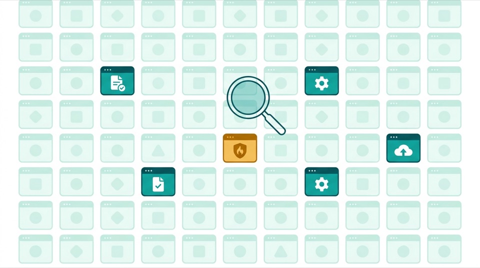
A handful of internal systems are genuinely mandatory — payroll runs through them or badges don't open doors. Everything else competes, whether you acknowledge it or not. The reporting tool competes with a CSV and a pivot table. The project tracker competes with a shared doc. The knowledge base competes with "ask Deniz on Slack." The procurement workflow competes with an email to a friendly vendor and an apology later. Every internal tool has a substitute, and the substitute is usually worse for the company and easier for the user.
When a customer churns, a dashboard turns red and three teams get paged. When an employee churns from an internal tool, the tool's usage graph just… sags, unwatched, while the work leaks into:
None of this appears in any system of record. The tool still "works." The licenses still get renewed. The maintenance team still ships releases — to an audience that mostly left. And the costs are real: duplicated data, broken audit trails, compliance exposure, and hundreds of small daily frictions that add up to how it feels to work at your company.
Usage tells you churn already happened. Sentiment tells you it's coming. A tool sliding from 4.1 to 3.2 stars over a quarter is broadcasting its future usage graph — and giving you a window to act before the workarounds calcify into habit. That's why measuring internal tools needs both signals on one dashboard: usage for the facts, ratings for the forecast. A tool with high usage and collapsing sentiment isn't healthy; it's a hostage situation with a countdown. (How to instrument both: measuring internal tool adoption.)
 morvero